Some gemstone and metal combinations feel almost inevitable once you see them side by side, and morganite set in rose gold is one of them. Morganite is a soft, peachy pink member of the beryl family, the same family that gives us emerald and aquamarine, and its color runs from the palest blush to a warmer salmon. Rose gold, tinted by the copper blended into it, carries a rosy warmth of its own. Put the two together and they seem to belong to the same family of tones, echoing and deepening each other rather than competing. This guide looks at why that pairing works so reliably, and when you might reach for a cooler or brighter metal instead.
How rose gold echoes morganite’s peach
The reason the pairing reads as so natural comes down to shared undertones. Morganite sits on the warm side of pink, leaning toward peach, apricot, and coral depending on the individual stone. Rose gold is built from yellow gold plus a measure of copper, and that copper pushes the alloy into a pinkish, rosy register. Because both the stone and the metal draw from the same warm corner of the spectrum, the eye reads them as related rather than contrasting. The metal seems to pick up the faint blush in the gem and reflect it back, so a morganite that might look almost colorless against a stark background suddenly appears warmer and more saturated once it is cradled in rose gold. It is a quiet trick of context, and it is the single biggest reason people gravitate to this combination.
If you are weighing which gold suits a warm-toned stone before you commit, it helps to understand how rose, yellow, and white gold compare in the way they treat color. Each alloy has its own bias, and knowing that bias makes the morganite question far easier to answer.
The monochrome effect
Designers often talk about tonal or monochrome dressing, where a look is built from a single-color family in slightly different shades. Rose gold and morganite create exactly that effect in miniature. Because the stone and the setting share a hue, the piece reads as one continuous gesture rather than two separate elements bolted together. There is no hard visual seam where the metal stops and the gem begins, just a gentle gradient from the rosy alloy into the blush of the stone. This is why the combination feels calm and cohesive rather than busy. It flatters people who prefer understated, harmonious jewelry over high-contrast statement pieces, and it photographs beautifully because the camera is not forced to reconcile two clashing tones. The whole piece glows in a single warm key.
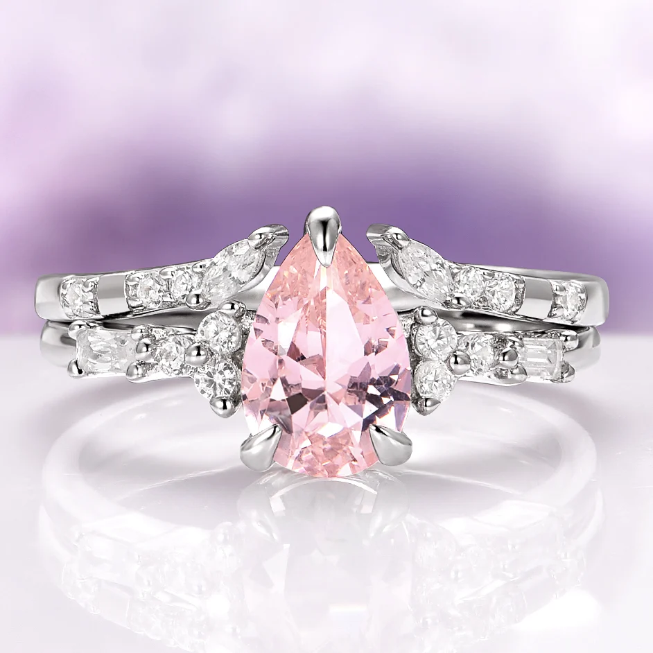 Morganite’s blush tone sits naturally beside warm metals.
When white metals give contrast instead
A monochrome pairing is lovely, but it is not the only good answer. Cool white metals like white gold, platinum, and sterling silver take the opposite approach: instead of echoing morganite’s warmth, they set it off. A silvery frame reads as neutral and slightly cool, so the peach of the stone looks pinker and more distinct by comparison. This is the same principle a painter uses when placing a warm color against a cool one to make it advance. If you want the morganite itself to be the clear focal point and you enjoy a crisper, more modern look, a white metal delivers that separation. The tradeoff is that you lose the seamless, glowing continuity that rose gold provides. Neither is better in the abstract. It depends on whether you want the stone to blend into a warm whole or to pop against a cooler surround.
- Choose a warm metal when you want harmony and a soft, tonal glow.
- Choose a cool white metal when you want the pink to stand out with more contrast.
- Consider how the metal will sit against your skin tone, since warm and cool alloys flatter different complexions.
Yellow gold as a third option
Between the rosy and the silvery extremes sits classic yellow gold, which behaves as a genuine third path rather than a compromise. Yellow gold is warm like rose gold, so it still harmonizes with morganite’s peachy character, but its warmth leans golden and sunlit rather than pink. The result is a pairing that feels vintage and rich: the honeyed metal and the blush stone read as complementary warm tones that are related without being nearly identical. Where rose gold produces near-monochrome unity, yellow gold introduces a gentle two-tone warmth, pink beside gold, that has a heritage feeling to it. If rose gold seems too matchy or you simply prefer a more traditional metal, yellow gold keeps the cohesive warmth while adding a little tonal variety. It is an especially good choice for anyone who already wears yellow gold and wants a morganite piece that will sit comfortably alongside the rest of their collection.
Matching the intensity of stone and metal
Beyond hue, there is the question of intensity, and this is where thoughtful pairing separates a good piece from a great one. Morganite varies in saturation. Some stones are so pale they read almost like a whisper of pink, while others carry a fuller, warmer peach. Rose gold likewise comes in different strengths depending on how much copper the alloy contains, from a barely-there blush to a distinctly rosy hue. The most pleasing pieces tend to match intensity to intensity. A very pale morganite pairs elegantly with a softer, subtler rose gold so that neither overwhelms the other, keeping the whole thing delicate. A deeper, more saturated morganite can stand up to a richer, more pronounced rose tone without being swallowed by it. When the strengths are badly mismatched, one element can make the other look washed out or muddy. So it is worth looking at the actual stone and the actual metal together, in the same light, rather than assuming any rose gold will flatter any morganite equally.
This is also the point where personal taste does most of the work. If you love the idea of a soft, cohesive rose gold morganite ring, aim for balance between how strong the pink of the stone is and how rosy the metal reads, and the piece will hold together beautifully in any light.
Coordinating a pink-toned set
Once you have one rose gold and morganite piece, it becomes surprisingly easy to build a coordinated look around it. Because the pairing lives in such a specific warm-pink register, other pieces in the same family fall into line naturally. A pendant, a pair of studs, and a ring in the same metal and stone read as a considered set even if they were never designed as a matching suite, precisely because the tonal language is consistent. You can extend the palette with related warm stones such as peach or champagne tones, or with plain rose gold pieces that carry the color without any stone at all. The trick to a coordinated set is restraint: let the shared warm-pink thread do the connecting, and avoid throwing a sharply cool or high-contrast piece into the mix unless you want it to stand apart deliberately. A little repetition of tone across a few pieces creates a polished, intentional effect that feels far more expensive to assemble than it actually is to plan.
Reading the light before you decide
One last consideration ties all of this together: light changes everything. Morganite and rose gold both shift subtly depending on whether you are standing in cool daylight, warm indoor lamplight, or the golden wash of late afternoon. Warm artificial light amplifies the pairing’s rosy glow and can make a pale stone look richer, while flat, cool light tends to mute both the stone and the metal toward neutral. If you can, look at a piece in more than one setting before you decide it is the one, because the version you fall for under a jeweler’s warm display lights may look a little different at your desk or in the open air. None of these shifts are flaws. They are simply part of the living quality of warm-toned jewelry, and once you understand them you can choose a stone-and-metal balance that looks the way you want in the light you actually spend your days in.
The takeaway: Rose gold and morganite belong together because they speak the same tonal language, two warm, rosy notes that reinforce rather than fight each other. That shared warmth gives you a soft, cohesive, near-monochrome glow that is hard to achieve any other way. But it is not the only option worth considering: cool white metals sharpen the stone through contrast, and yellow gold offers a heritage-feeling middle path. The real skill lies in matching intensity to intensity and reading the piece in real light. Get that balance right, and whether you choose rose gold, a cooler frame, or golden warmth, the morganite will look exactly as you hoped.